Many StatsD metrics are, at their core, counts–that is, they measure the number of relevant events that occurred over a span of time. In some cases, it’s easiest to think of them in terms of a per-second rate that varies smoothly over time. For instance, take this metric measuring queries per second over a couple of days:
Other times, it’s easiest to model this sort of data as a count of events that have occurred within a clearly defined span. This is particularly appropriate where events happen less predictably, such as in this metric taken from Datadog’s intake pipeline:
Both graphs represent counts, but in different and complementary ways. That’s why we’re introducing tools that’ll make it easier for you to choose the right visualization for your StatsD rates and counters. In this post, we’ll show you how to do this using Datadog.
Calculate rates and counts with StatsD
When you look at a Datadog graph, you’re not seeing the raw points as submitted by the Agent or to the API. Instead, you’re seeing the points aggregated on a particular resolution. By default, an hour long query shows a point every twenty seconds, while a four hour graph shows a point every minute. Datadog’s query engine does the work of coming up with a sensible aggregate based on the timeframe requested.
Given this, there are two equally sensible ways of viewing this data. You might be interested in the “raw” counts–that is, the number of relevant events that happened in a given time interval. Or you may find it easier to view the same information, but normalized to a per-second rate by dividing the raw counts by the width of the interval.
To emphasize these differences, we’ve introduced a new bar graph visualization. By default, viewing a metric as a count shows a bar graph, where each bar represents a particular interval in time. Viewing metrics as rates, meanwhile, defaults to our stacked areas visualization, as shown above.
Choose the best visualization: counts vs. rates
The count and rate representations have their respective advantages and disadvantages. Counts, for instance, allow you to quickly see how many of a particular event happened in a short amount of time. Counts can also be a preferable visualization when there are gaps between occurrences of events, such as this chart of web errors:
In contrast, rates suggest a value that is continuously changing over time. Thus for rates, our default visualization is the stacked area. Rates can also be easier to work with across multiple timeframes, as their value is less dependent on the rollup interval than that of counts. For example, here are two views of system intake throughput, with the first over an entire month and the second zoomed in (around April 27):
Note that despite the large difference in timeframes, the y-scales of both graphs are relatively similar which facilitates easier comparison when zooming. If this metric was instead calculated as a count, the two graphs would have very different scales.
Make your own counts graphs
So, how do you use these features in your own dashboards? We’ve updated the Graph Editor to help you create your own counts visualizations.
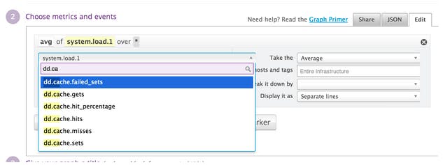
First, open Graph Editor and select a metric as you normally would:
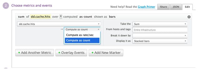
When you select a metric, Datadog will check whether it is one that can be used with our counts feature. Currently, metrics that can be used are rates and counters submitted through DogStatsD. If the metric is supported, you’ll see a drop-down prompting you to select how the metric should be calculated.
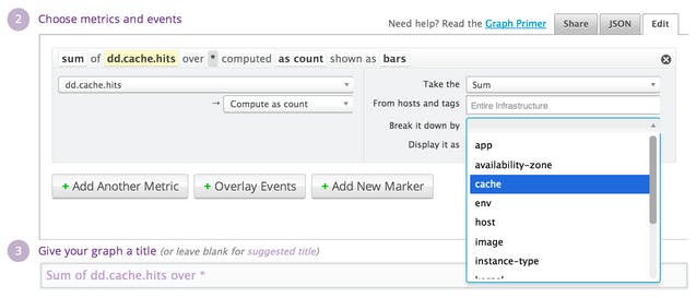
You can then select your preferred visualization type, the scope over which the query should be run, whether and how it should be broken down by group, and so forth, just as you would for any other graph.
And that’s it! In this case, we’ve chosen to represent our metric as a bar graph, which gives the following result:
For more advanced queries, you can use this feature in the query JSON editor by adding .as_count() or .as_rate() to the end of the scoped metric definition–that is, the metric definition plus the scope and (if provided) group by clauses. For instance, we can look at the top 5 caches, by the number of hits:
The result can then be used in more complicated expressions, such as the following:
sum:dd.cache.hits{*}.as_count()sum:dd.cache.hits{*} by {cache}.as_count()Note the location of .as_count() for this example; it must come after the group by clause.hour_before(sum:dd.cache.hits{*}.as_rate())ewma(sum:dd.cache.hits{*} by {cache}.as_rate() / sum:dd.cache.hits{*}.as_rate())
A note of caution when using the JSON editor: as discussed above, the .as_count() and .as_rate() features don’t work with all metrics; using with unsupported metrics will have no effect. You can check which metrics are valid by using the Graph Editor UI. If the “compute as count” option shows up for a particular metric, it means that .as_rate() or .as_count() should work as expected.
Visualize and share counts StatsD metrics graphs on screenboards
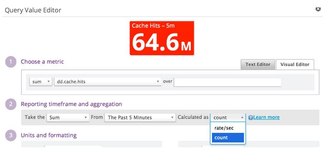
Finally, you can visualize counts on Datadog screenboards using both the timeseries and query value widgets. For the query value widget, the interface is similar to that used for timeseries graphs. When you select a supported metric, a rate / count selector appears:
The two calculation methods support different types of time aggregation. Rates support the usual trio of average, min, and max over the lookback window. Counts, on the other hand, can only be summed over the specified window.
Coming soon: Expanded scope of counting metrics
As mentioned above, this feature only works on a subset of StatsD metrics. We’re working on expanding the scope of metrics that can be used with this functionality. As we make this available for more metrics, you’ll see the changes reflected automatically in the Graph Editor UI.
If you’re already using Datadog and have any questions about the counts graphing feature, email us at support@datadoghq.com. If you’re not using Datadog and you’re interested in better visualization of your StatsD rates and counts and the rest of your infrastructure metrics, sign up for a free 14-day Datadog trial and check out this new feature for yourself.
Good luck and happy counting!


