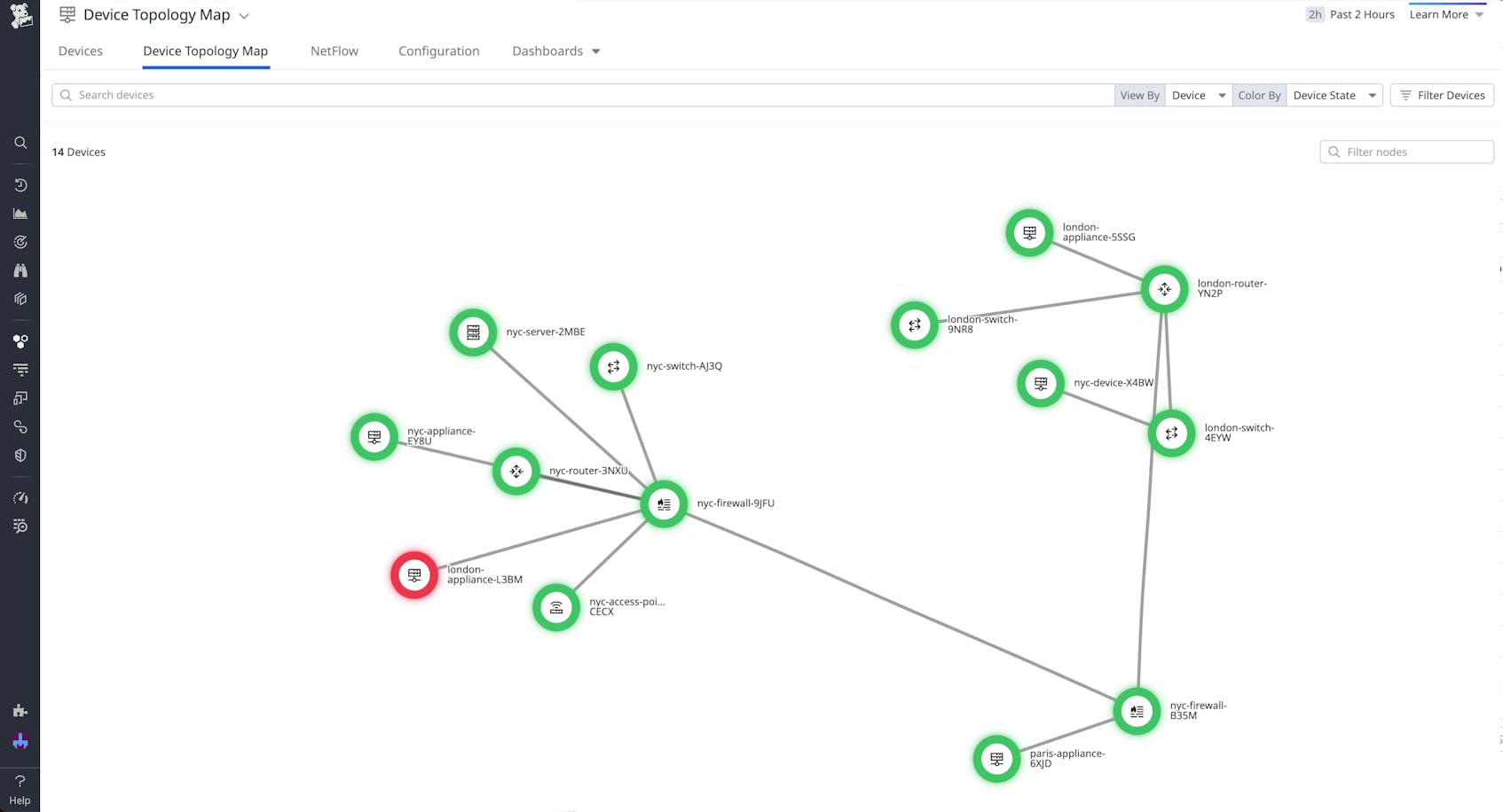
Network engineers need clear visibility into the relationships and dependencies of their network devices so they can quickly troubleshoot when issues arise. But when dealing with the potentially thousands of devices that comprise a modern enterprise network, engineers often need to navigate a complex web of interconnected signals in order to trace the sources and consequences of poor network performance.
With the Device Topology Map in Datadog Network Device Monitoring (NDM), instead of relying on institutional knowledge or going one by one across each device to identify failures, you can quickly get a big picture summary of how your network is connected. Through dynamic device links, detailed health metrics, and granular tagging, the Device Topology Map helps you easily find starting points to troubleshoot the source of issues that may be causing problems upstream or downstream.
In this post, we’ll show you how the Device Topology Map provides valuable context and actionable data to help you quickly:
- Visualize the topology of your on-premises network infrastructure at a glance
- Reduce mean time to resolution (MTTR) by pinpointing problematic devices
Visualize the topology of your on-premises network infrastructure at a glance
By displaying the connections between all your network devices, the Device Topology Map provides your teams with a real-time, high-level summary of how your network is arranged. The map uses Link Layer Discovery Protocol (LLDP) and Cisco Discovery Protocol (CDP) to dynamically generate links between devices. If you’re using Autodiscovery to set up NDM, the Device Topology Map will also automatically update to reflect ongoing changes to your network, such as any devices that have been added or taken down.
For network environments with thousands of devices and connections, it can be difficult to pinpoint areas of concern due to the visual noise on screen. With the Device Topology Map, you can easily group devices by tags to assess your network health based on the characteristics that are most important to your team, such as data center or location. Additionally, the Device Topology Map uses icons to represent different device types—including routers, switches, firewalls, and access points—making it easy to visually identify what devices make up your network and how they are connected.
Reduce mean time to resolution (MTTR) by pinpointing problematic devices
For a quick glance at the health of individual devices, you can hover over a node to access a panel that contains information such as the device name, when it was last seen, and its uptime, as well as metrics such as the average CPU or memory utilization. Additionally, you can easily dig deeper and investigate the other interfaces connected to the device, with details about associated interface names, IP addresses, and errors displayed. From this panel, you can also pivot to the main NDM page for further insight into a particular device, with the ability to track performance and hardware metrics over time, or investigate the sources of network congestion by examining network traffic in NetFlow Monitoring.
If you notice an issue while looking at the data for an individual device, you can trace connected interfaces through your network to find related devices that may be experiencing failures. Additionally, by customizing the color of the devices in the Device Topology Map, you can make it even easier to detect and track issues in your physical network depending on the signals most relevant to your investigations. For instance, if you want to determine whether an issue indicated on the map is due to a device failure or an SNMP failure, you can change the device color rules from Device State to Ping State to easily compare signals.
These features make it easy for your team to pinpoint issues across your network and start troubleshooting immediately. Let’s say you’ve received a notification that your Paris data centers are experiencing outages. By filtering your devices in the Device Topology Map based on the data center tag, you can easily identify the ones in your Paris location that are experiencing issues. The color coding and icons help you pinpoint the specific devices that are down, and by tracing their connections to each other, you can start to determine which device is at the root of the issue. You’re then able to access device metrics to investigate what might be causing the problem, as well as determine the exact upstream or downstream impacts involved.
Get started with the Device Topology Map today
With the Device Topology Map in Datadog NDM, you can visualize all the devices in your network and their connections in one place. Customized tags and colors help you quickly identify and investigate issues across your network, while detailed health metrics enable you to start immediately digging deeper into problems within your devices.
You can use our documentation to learn more about getting started with the Device Topology Map. If you’re not yet a Datadog user, you can sign up for a 14-day free trial.


