
Modern code profilers gather performance data that is highly useful for developers, but the traditional presentation of that data can be challenging to interpret for engineers who are new to profiling. For the Continuous Profiler team at Datadog, our guiding mission is to make profiling a standard practice for all developers by flattening its learning curve and helping teams quickly gain insights into application performance.
Recently, we’ve made some enhancements to Continuous Profiler’s visualizations to make them even more accessible to engineers. Specifically, we’ve implemented several key changes to our flame graph visualization and are introducing a new visualization, the call graph.
In this blog post, we’ll discuss:
- How we made the flame graph more intuitive
- How the new call graph visualization summarizes profiling data
Making the flame graph more intuitive
Flame graphs are used widely to visualize profiling data in the software industry and have been the default view in Continuous Profiler since the product’s launch in 2020. Their core layout has remained largely unchanged since their creation: Each frame maps to an element in the call stack of a running program, with the frame’s width indicating how much a resource is used.
Until recently, a typical flame graph in Continuous Profiler looked like the one in the screenshot below. In this particular example, frames map to methods, and frame widths indicate how much CPU was used by the associated method:
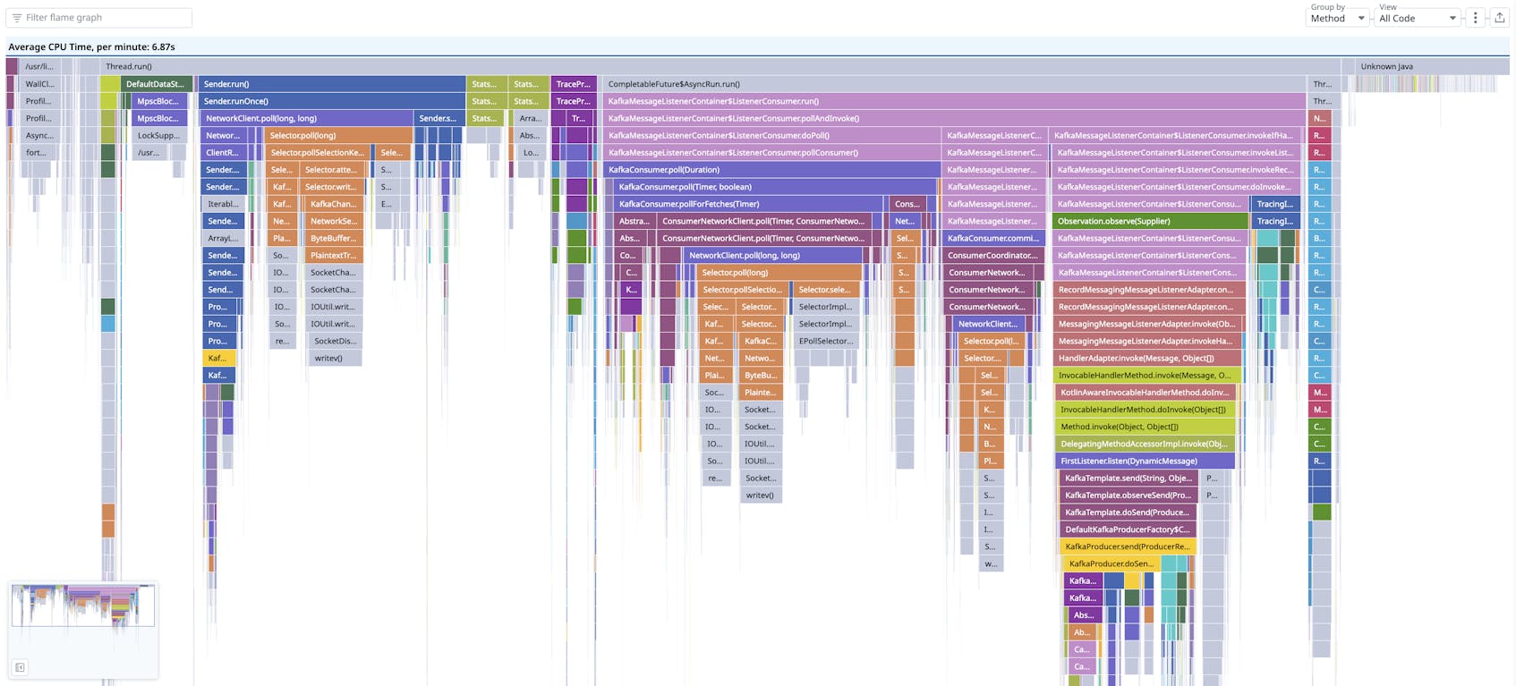
In these earlier flame graphs, frames were colored based on the name of the package to which the method belonged. The order of the frames from left to right was determined by a complex algorithm that took into account the frame type, whether the “Only My Code” feature was active, and alphabetical ordering.
Problems with interpreting the older flame graph
But with this formatting and presentation, we found it could be challenging for engineers to read flame graphs accurately, in particular when dealing with an unfamiliar codebase. In this scenario, it could be tough to immediately discern what the frame colors signified or what the ordering of frames from left to right meant.
We also learned that misunderstandings sometimes arose with frame colors because of what those colors can signify in different cultural contexts. For instance, we wanted to make sure that users didn’t interpret red frames as indicators of a problem—or green frames as signs that everything was OK—with respect to the method in question. We also didn’t want people to think that frames were arranged in chronological order, from left to right, because many Datadog visualizations represent elapsed time along the X-axis.
Introducing the new-look flame graph in Continuous Profiler
We decided to revamp our flame graphs to eliminate some of the common obstacles users faced when first interacting with our product. Today, a flame graph in Continuous Profiler looks like this:
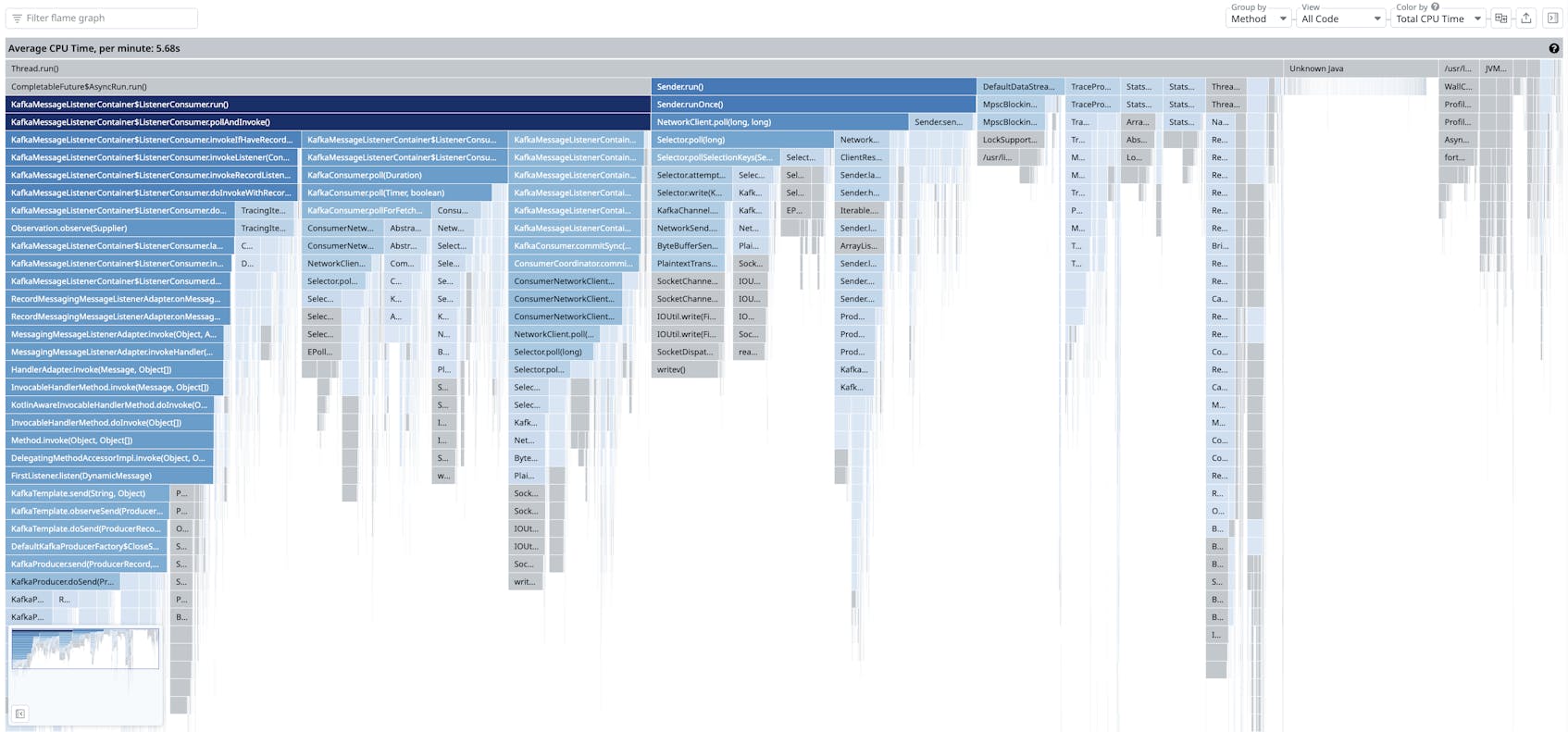
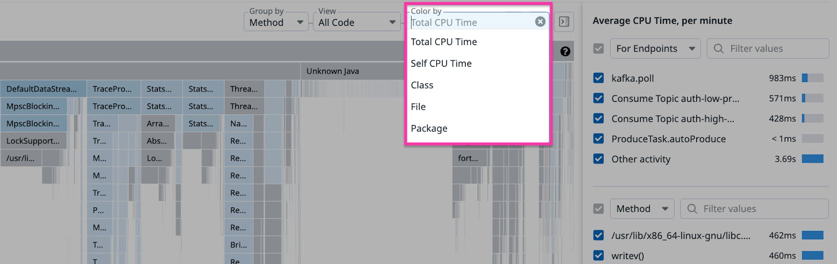
The first and most obvious change we have introduced is a new color coding scheme where the frame’s shade corresponds to resource usage. This results in a color gradient whose variations intrinsically convey specific and useful information: Darker frames indicate higher resource usage, while lighter frames signify lower usage. The same color coding scheme can be found in other Datadog visualizations, such as user retention graphs, making it easier for users familiar with other Datadog tools to interpret profiling data. Although frame width already indicates resource usage, using color as an additional cue helps non-experts understand the data. We also applied a similar color coding scheme for self time (e.g., the Self CPU Time option available in the Color by menu in the screenshot below) where the shade of a frame indicates how much self time corresponds to that frame. (Self time refers to the time a method has spent executing its own code, without counting the time spent by any other methods it calls.) For both total time and self time, this new gradient-based color coding strategy makes the product more approachable to new users while preserving all the functionality that experienced users already enjoy.
Second, we simplified our previously complex ordering of frames by offering users two alternative sorting algorithms to choose from. The first and default option, left-heavy sorting (shown as “Sort Frames By Total CPU Time” in the screenshow below), helps users focus on the most resource-intensive methods by grouping them on the leftmost side of the flame graph. The second option uses alphabetical ordering based on method name (Sort Frames Alphabetically A–Z), which provides the benefit of maintaining a stable and predictable frame order even as resource usage changes.
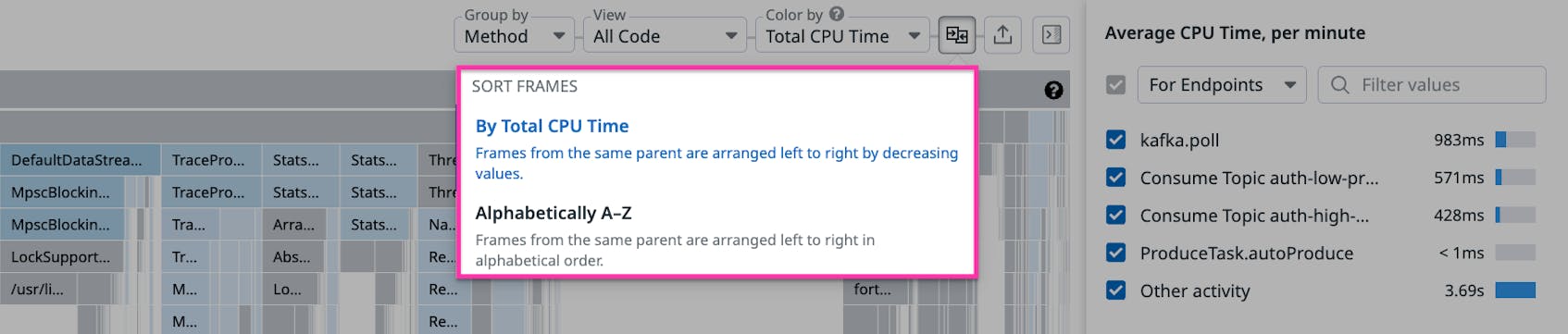
Finally, above the flame graph in the user interface, we exposed and prominently positioned all the Color by and Sort Frames menu selectors that are used for toggling between the new coloring and sorting modes. The clear placement of these menus above the flame graph now effectively allows them to serve as a legend, giving users a clearer understanding of all the available profiling visualization options.
Based on our user testing and customer feedback about these new features, we believe these improvements have made it easier for less experienced engineers to understand profiling flame graphs.
Using call graphs to summarize resource usage patterns in profiling data
While flame graphs are extremely powerful for visualizing fine-grained activity, it’s difficult to use flame graphs to derive the cumulative impact of a method on resource usage. Engineers who are new to profiling, for example, could miss how a specific method and its call chain are consuming a high amount of resources—and therefore could also miss important optimization opportunities related to this usage pattern.
Continuous Profiler’s new call graphs take the same profiling data used in flame graphs—including stack traces and other metadata—and visualize it in a way that highlights the relationships among methods called in a service and their impact on resources. To achieve this effect, the call graph displays each method just once, as a single node (i.e., a rectangle or box), with edges (represented as arrows between these nodes) used to convey which methods have called each other. This arrangement makes it easier to discern which methods have called each other within the profiled data and how much time was spent executing each individual method or call chain. This is different from a flame graph, where a method appears in separate frames when it is called by different methods, with “parent” frames appearing over “child” frames to show which methods have called which.
The following screenshot displays an example call graph. With this visualization, it’s easy to see how the method represented by the large blue node at the bottom is dominant. Specifically—and as stated in the pop-up window to its left—executing the code inside the method accounts for 13.4 percent of all the time spent in the profile (Self CPU Time) and 37.5 percent if you also include the time spent in methods that this method calls (Total CPU Time). In this way, the call graph makes it easy to gain insights into the overall resource impact of individual methods and their call chains.
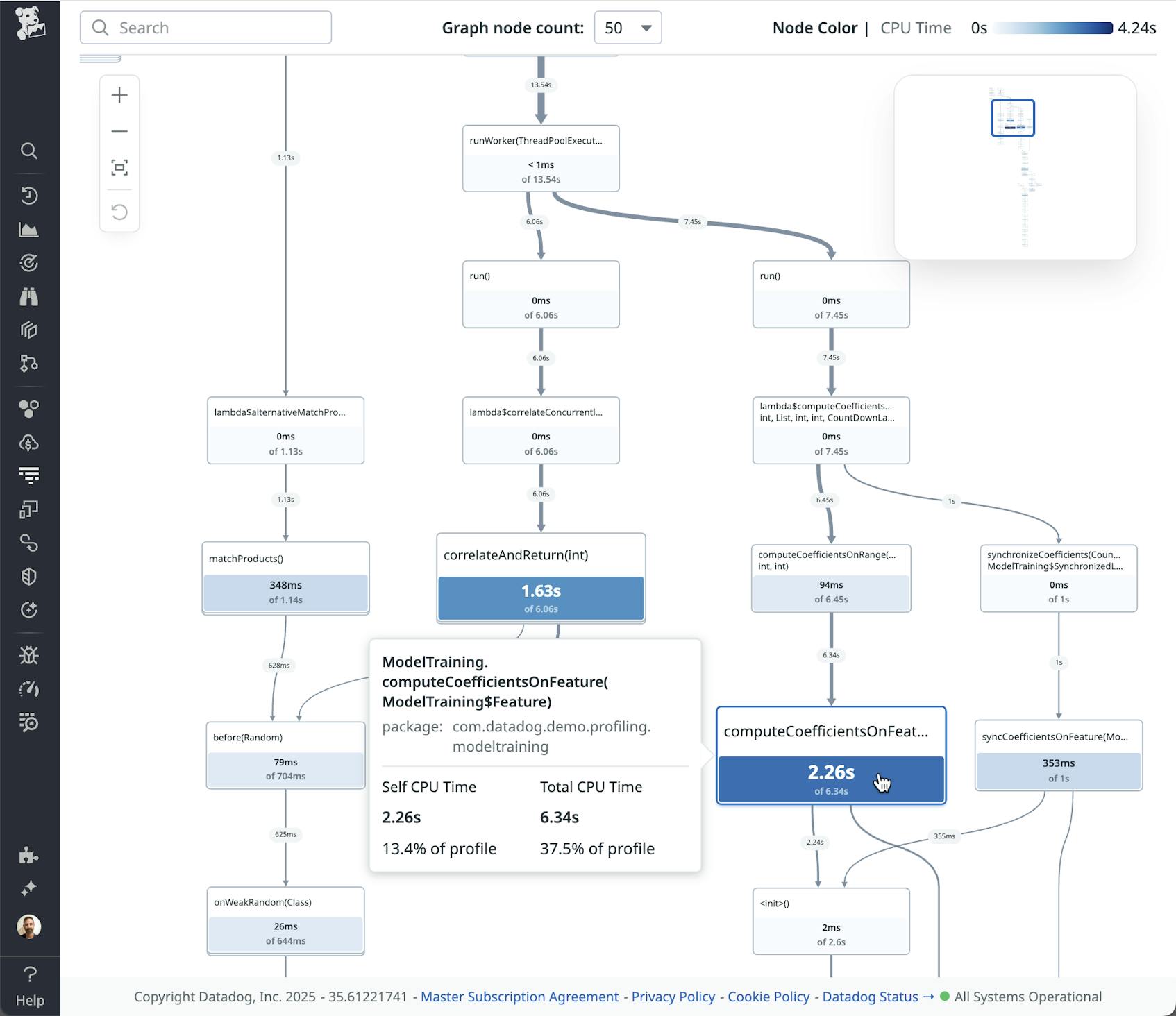
Besides emphasizing usage patterns and relationships, call graphs can also clearly represent the calling patterns among methods in a service—patterns including self-recursion, cycles, and chains of method calls. Representing these patterns visually provides a “bird’s eye view” of how the parts of a system work together.
Come work with us!
The call graph was dreamed up and realized by Datadog engineer Ruwani De Alwis, who began this project as an intern! We think it’s a significant contribution—and that it proves how we value and encourage creative solutions from everyone on our team. If you’d be interested in working for our Engineering team, check out our job openings.
How call graphs convey information
Like flame graphs, call graphs encode the contributions of self and total time, but the information is conveyed differently.
- Call graphs use edge (arrow) thickness to show time spent calling other methods.
- Call graphs use color and size to indicate self time.
- Because each method is represented by a single node in the visualization, the overall importance of the node in aggregate terms is intuitively easy to discern. (In contrast, in a flame graph, a method’s total impact may be distributed across many scattered frames.)
The other distinctive feature of call graphs is that they use a graph pruning technique, which hides nodes that have a less significant impact—reducing the number of nodes that you see when first accessing the visualization. These nodes and edges that get pruned away aren’t permanently deleted, but only temporarily hidden. You can reveal them by clicking on any “+” button attached to a node, as shown in the image below.
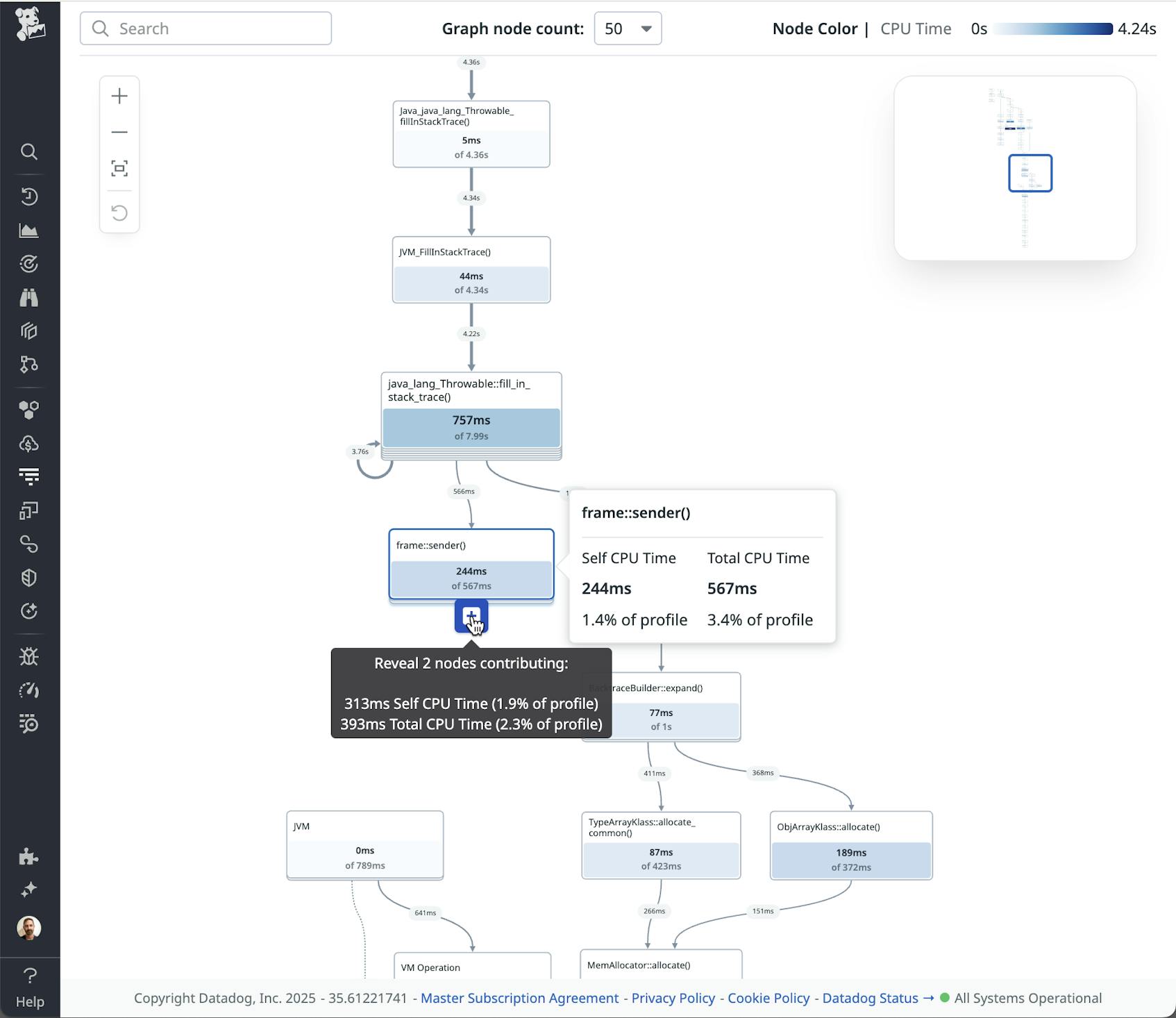
This ability to start with a simple graph and progressively disclose complexity makes call graphs an approachable visualization in comparison to flame graphs, which start off showing as much detail as possible.
Overall, we see flame and call graphs as complementary visualizations. While flame graphs provide a complete and more fine-grained picture of resource usage, call graphs summarize information about method usage, relationships, and patterns in a way that is easy to immediately understand. The two visualization types lend themselves to different insights and different ways of exploring.
We’re excited to see how users put the new call graph visualization to use. By adding this new element to the profiling toolkit, we hope to unlock even more value for engineers at all levels.
See your profiling data visualized more clearly than ever
We are continuing to improve the functionality of Continuous Profiler to make this powerful product even more accessible and easy to use. Recent examples of feature enhancements include the introduction of source code previews and the timeline view. And now, you can see the new flame graph features in Continuous Profiler. Call graph visualizations are currently in preview and will be rolling out to customers over the coming weeks. When they are available, you can see them in the visualizations (“Visualize as”) bar.
For more information about our Continuous Profiler product, check out our product documentation. And if you’re not yet a Datadog customer, feel free to sign up for a 14-day free trial to get started.