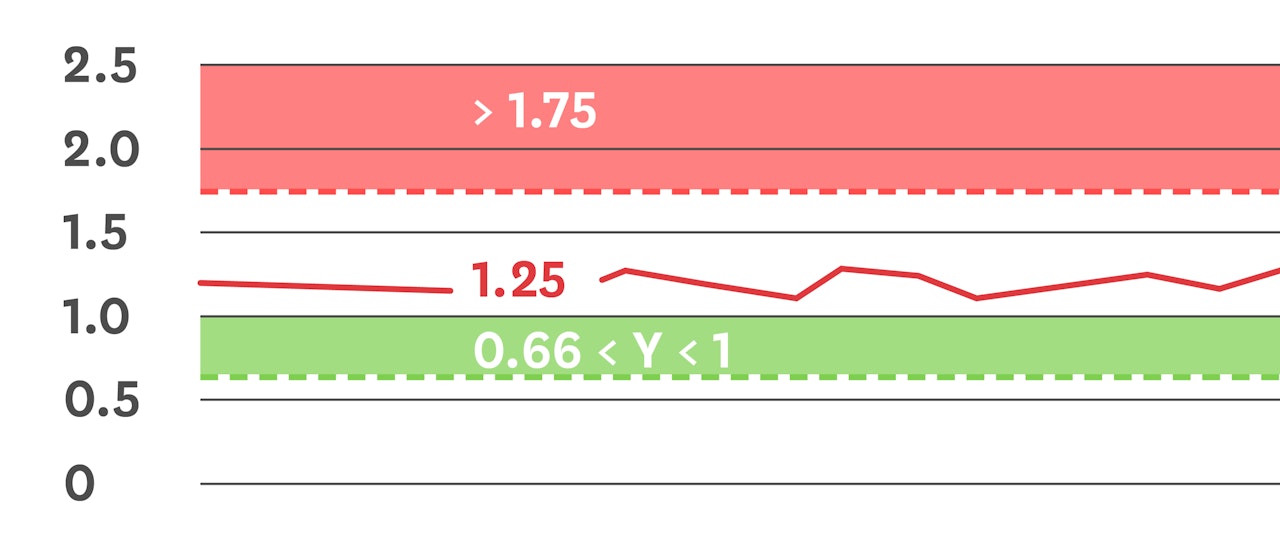
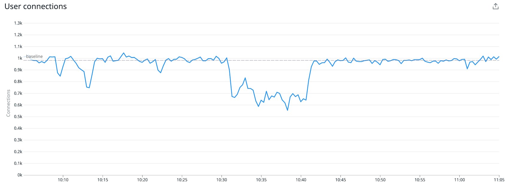
If you’ve received alerts from Datadog, you know that part of what makes them more useful than an email full of exclamation points is the graph snapshot with shaded regions and lines showing the alert threshold and triggering value. Today, we’re excited to announce the release of graph markers that give you the power to draw these regions and lines on your dashboard graphs, making it easier to interpret the state of your system.
Not every interesting or unexpected condition deserves an alert, but you may still want people paying attention to certain boundaries. Likewise, some metrics and systems may be unfamiliar to some people on your team and a dashed line or two can be a big help in letting them know what’s considered normal and more importantly, what’s not normal.
How to implement graph markers
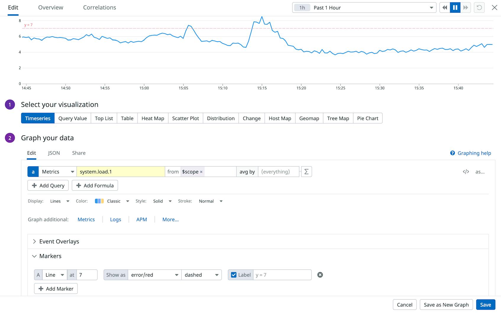
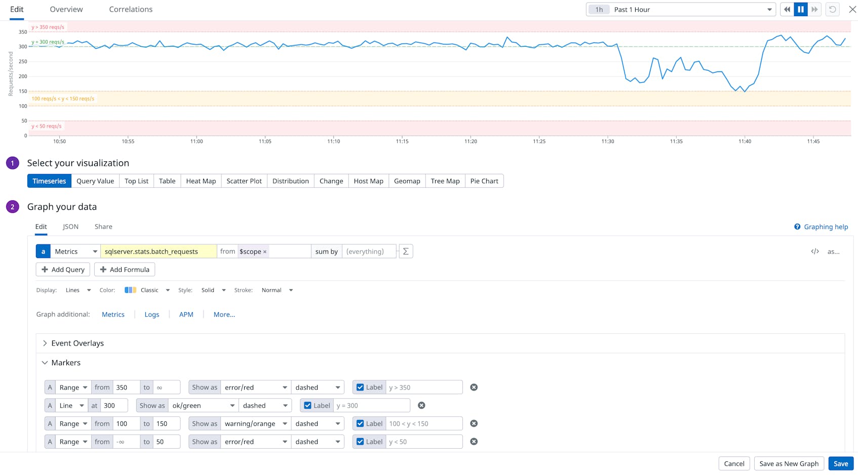
Adding markers to your dashboards is easy: just open the graph editor and click the “Add Marker” button. From there you can customize your graphs using ranges or lines.
Below are a few examples of markers you can create:
- Set a range to draw a shaded region or line on the graph
- Set both ends of a range to shade a band
- Set only the lower value to set a minimum boundary and shade everything above that value
- Set only the higher value to shade everything below
- Set a single value to draw a line
Furthermore, you also have the ability to style and label the marker as well as set markers using K/M/G suffixes for big values, e.g. “325K” instead of 325000.
Sometimes showing multiple thresholds can be helpful in order to get a better idea of the severity of a condition. Set multiple markers with escalating values by successively clicking the “Add Marker” button and they will be overlapped for you to show the progression.
We hope you find this feature as useful as we do and that it makes your graphs even easier to understand. If you’re interested in creating your own custom dashboards and graphs, you can try Datadog for free for 14 days.
Happy marking!


