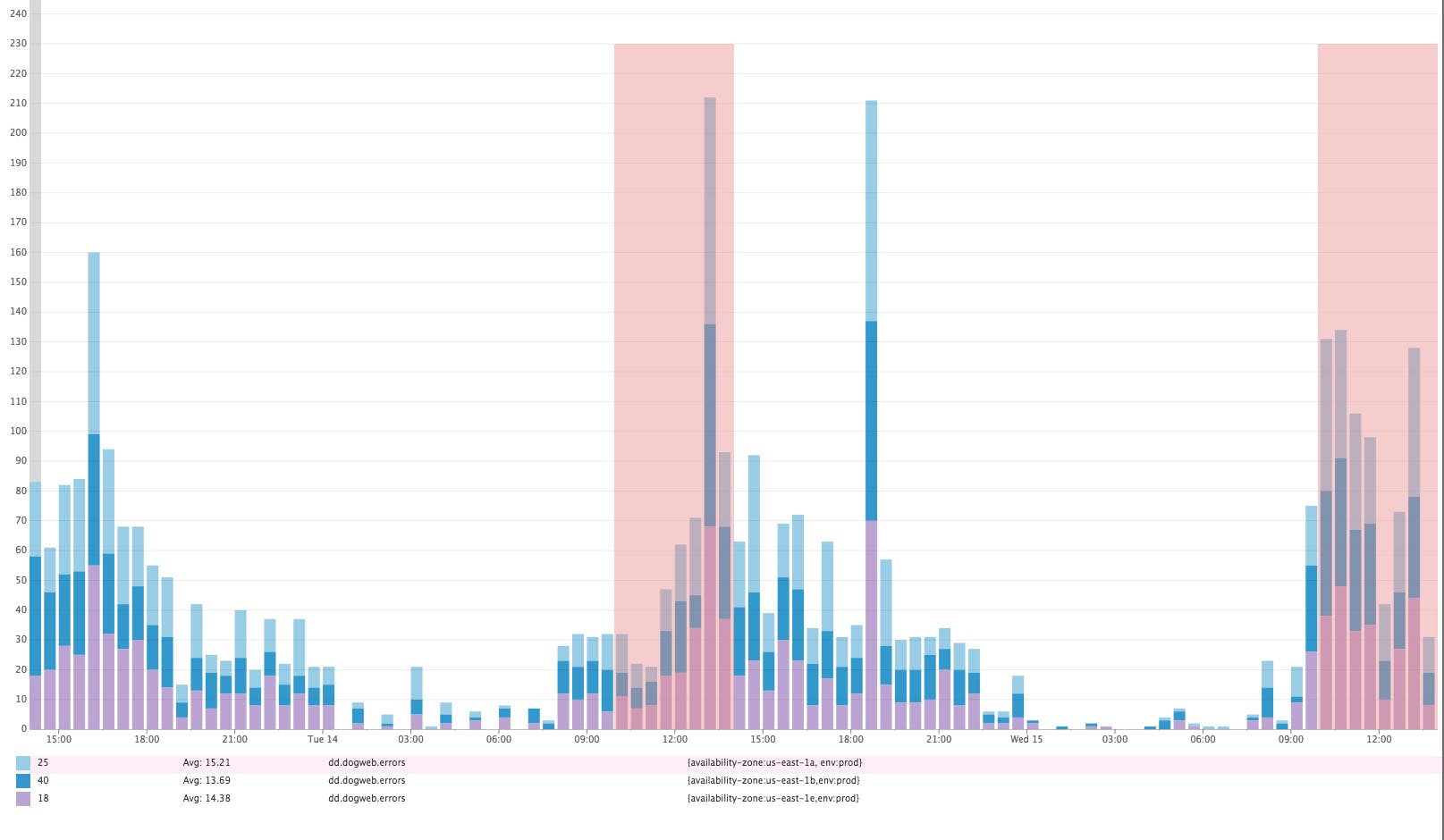
Often you want to visualize your metrics in rich detail, but sometimes trends are more telling. For example, in the graph below we show the last two days of server-side web errors broken down by availability zone. You probably can’t easily tell whether there were significantly more errors in the past four hours than there were in the same time window yesterday—neither broken down by availability zone nor in total.
If error rates are significantly higher, it may warrant investigation, but this can be difficult to determine if the magnitude of the change is not clearly visible. That’s why we are introducing Change Graphs.
Change Graphs are designed to help you instantly measure changes by highlighting differences between two identical timeframes—for example between right now and yesterday, or right now and last week. Change Graphs are especially useful for revealing changes in relation to seasonality.
Easy to see changes
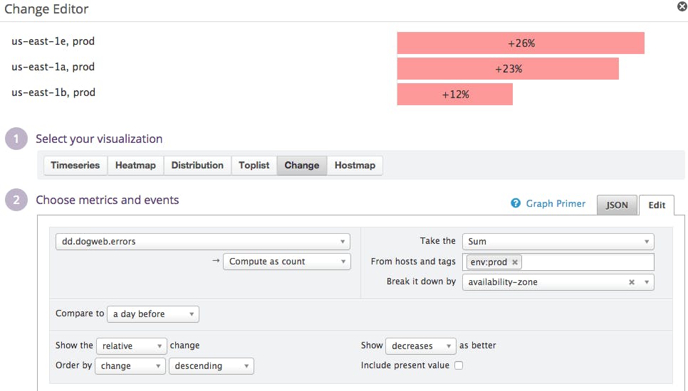
Below is a Change Graph visualization rendering the same server-side error information as in the graph above, but showing the changes in volume rather than the entire histogram. We are comparing the past 4 hours with the same timeframe yesterday.
Instantly, we see that we are experiencing more errors today than yesterday, and that all availability zones are affected.
Change Graphs can be particularly helpful on your screen boards to keep an eye on changes in web traffic, login rates, errors, latency, and other top-level indicators of a healthy system.
Setting up a Change Graph
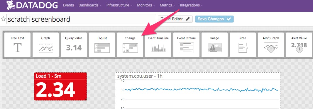
You can add a Change Graph to any Datadog dashboard via drag-and-drop or API—the same as you would add any other visualization, like a timeseries graph or heatmap.
- Select “Change” visualization
- Choose which metric you want to visualize, the variations, and the filters. If you want to compare with the same timeframe yesterday, just select “Compare to: a day before”
- Finally, select the window of data that you want to compare to the past. If your Change Graph is part of a time board, the timeframe you are comparing to will be the one you are currently visualizing (selected at the top of your board). For example, if you have selected “The Past Hour” as the timeframe, you will compare the entire last hour to an hour in a prior period (prior day, prior week, etc). If you are on a screen board, select the period of time you want to compare with the same period in the past, below “Set display preferences”. For example if you want to compare the past 4 hours with yesterday, like we did in the example above, select “Show: The Past 4 hours”.
If you’re already a Datadog customer, you can already try the Change Graph visualization on your current dashboards. To try it out in your own environment, sign up for a free trial of Datadog.


