
David M. Lentz
For complete visibility into the performance of your applications, you need telemetry data—traces, metrics, and logs—that describes activity across your entire stack. But if you're using multiple monitoring tools, your data can end up in silos, making it difficult to troubleshoot issues that affect your user experience. For example, if a graph shows a spike in latency or a drop in the rate of network connections, it can be hard to troubleshoot if you need to switch to a different tool to find the log entry that explains the issue. Overhead like this can increase your mean time to resolution (MTTR) and even lead to user churn or lost revenue.
End-to-end application monitoring in Datadog eliminates visibility gaps and unifies insights across your frontend and backend monitoring. Datadog's trace view gives you detailed request data and correlated information in a single pane of glass. In addition to the flame graph—which shows you the full path of each request—the trace view displays the corresponding metrics, logs, and other data you need to understand the context of the request so you can efficiently investigate performance problems like errors and latency.
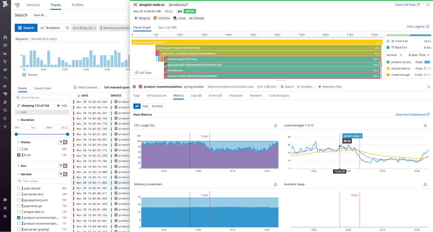
In this post, we'll look at how the trace view seamlessly presents all of your application monitoring data in one place for greater visibility and faster troubleshooting. We'll show you how to:
- Use tags to explore your traces and correlate them with RUM data
- See details about the infrastructure that processed the request
- Explore metrics that show the performance of relevant hosts, containers, and more
- View logs that correspond to the trace
- See error codes and stack traces related to the request
- List the processes running on the host or container at the time of the request
- Investigate the cause of errors and latency in network performance data
- Discover if any code hotspots may be the source of latency
Use tags to correlate traces with other data sources
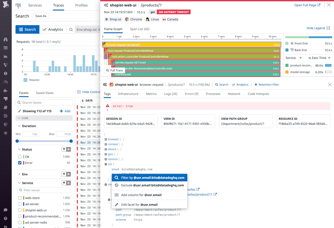
When you select a span in a flame graph, the Tags tab displays the metadata associated with that span. This includes unified service tags and any custom tags you've applied to your traces. Tags give you the power to filter your data so you can easily group and compare similar traces. For example, you can use the env tag to view all the requests within a single environment or the http.base_url tag to see all the requests to a single endpoint.
Datadog APM allows you to tag your spans with high-cardinality metadata, so you can associate each trace with a single customer or individual user. In the screenshot below, we're using the usr.email tag to filter our data to show only traces from a single user. This allows us to reconstruct the experience of an individual user, for example, if we need to investigate a hard-to-replicate bug report.
See the documentation for more information about adding tags to your spans.
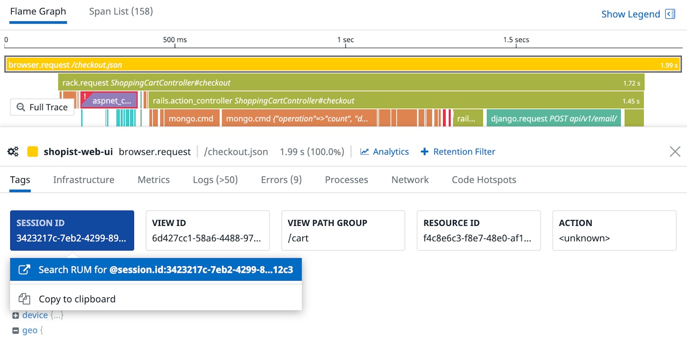
When you're viewing a span that visualizes the frontend performance of your app, you can easily pivot from the Tags tab to see correlated RUM data that shows you details of the request so you can identify frontend code that may need to be debugged. In the screenshot below, we've clicked on the session.id tag to pivot to the RUM Explorer, where we can reconstruct the user session. This can be helpful, for example, in determining whether a bug is associated with a particular user, browser, location, or other condition.
See the infrastructure beneath the traces
In a distributed architecture, each service in your application is backed by dedicated infrastructure—e.g., host, cloud provider, container, orchestrator, and serverless function—that processes that service's requests. As you hover over a span on the flame graph, the Infrastructure tab provides context by displaying details about the infrastructure involved in executing that particular unit of work.
You can filter your traces by their underlying infrastructure to isolate and compare a group of similar traces. In the screenshot below, we're filtering by host to see only traces from requests that were processed by a specific host.
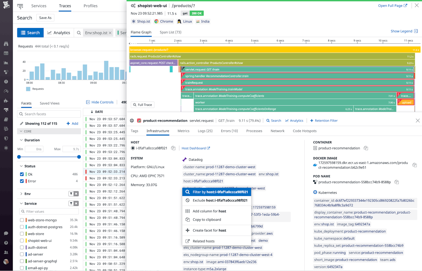
The infrastructure tags you'll see are specific to the architecture that processed the request you're viewing. Depending on your infrastructure, you'll see tags that describe your container runtime (e.g., Docker), container orchestrator (e.g., Kubernetes), and the cloud service where your workloads are running (e.g., AWS Fargate, Azure Container Instances, or Google Cloud Run.)
Using infrastructure tags to explore your traces allows you to see how your application is affected by the performance of your hosts, pods, or containers. For example, if you're investigating latency in your service, you can filter by pod to see a trace in the context of other workloads running on the same host, which could help you spot a noisy neighbor that's using more resources than it should.
Correlate traces with metrics
The Metrics tab provides details about the performance of the relevant infrastructure and services at the time of the request. The metrics you see here depend on the path of the trace. They can describe the performance of the host, container, and runtime, as well as AWS Lambda functions and Azure App Services.
A dotted vertical line on each timeseries graph indicates the time of the trace, making it easy for you to correlate the request with the metrics displayed. For example, in the screenshot below, the RSS Memory graph shows that the container's memory consumption had been rising steadily leading up to the trace that threw a 500 error. This information can help you focus your investigation on how the service uses memory, knowing that there was not a corresponding spike in CPU usage at the time of the trace.
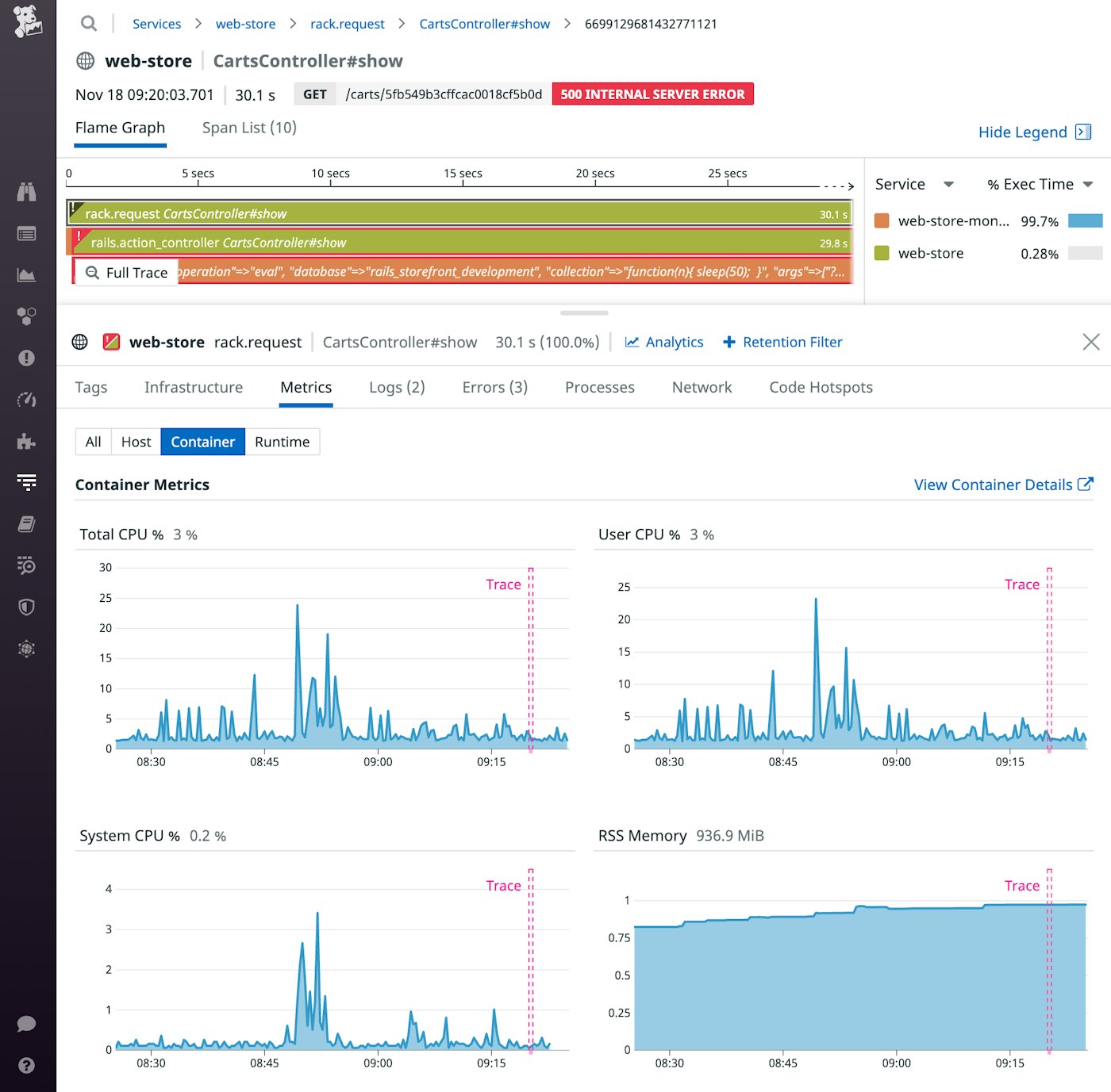
If you're viewing a trace from a RUM-enabled frontend application, the Metrics tab will also show RUM data which can help you understand the behavior of the browser, Android device, or iOS device.
You can also see metrics that describe the behavior of the runtime (Java, Python, Ruby, or Node.js) at the time of the request. These metrics vary across runtimes, and include data like the runtime's count of pages, objects, classes, and threads.
Correlate traces with logs
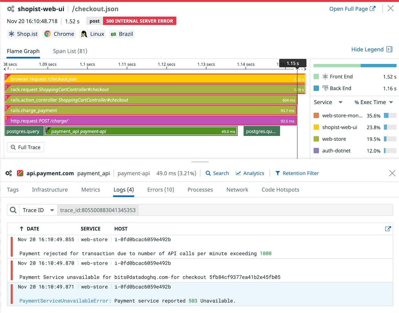
The flame graph can help you spot which service is slow or emitting errors, but your logs can tell you why it's happening. Datadog automatically correlates logs with traces and displays them in the Logs tab of the trace view. This allows you to see logs related to any span you're investigating without navigating to a different page.
In the screenshot below, the payment_api span in the flame graph clearly indicates an error. The relevant logs below show that PaymentServiceUnavailableError was preceded by a similar error scoped to a single user—Payment Service unavailable for bits@datadoghq.com, which was caused by the preceding API throttling error. This information could help you decide how to fix the issue—for instance, by queueing your calls to the payment service or increasing your allotted rate of API calls.
See the documentation for more information about using the trace view's Logs tab.
Investigate application errors
If your trace contains errors, you can hover over any of the error spans in the flame graph and view the full error message or stack trace in the Errors tab of the trace view. This helps you dig into the specifics of each error while seeing it within the broader context of other errors that occurred in the same trace.
The highlighted error in the example below gives very little information (error: true). But subsequent error messages include the Java exception and the relevant SQL statement to provide deeper context around the initial error.
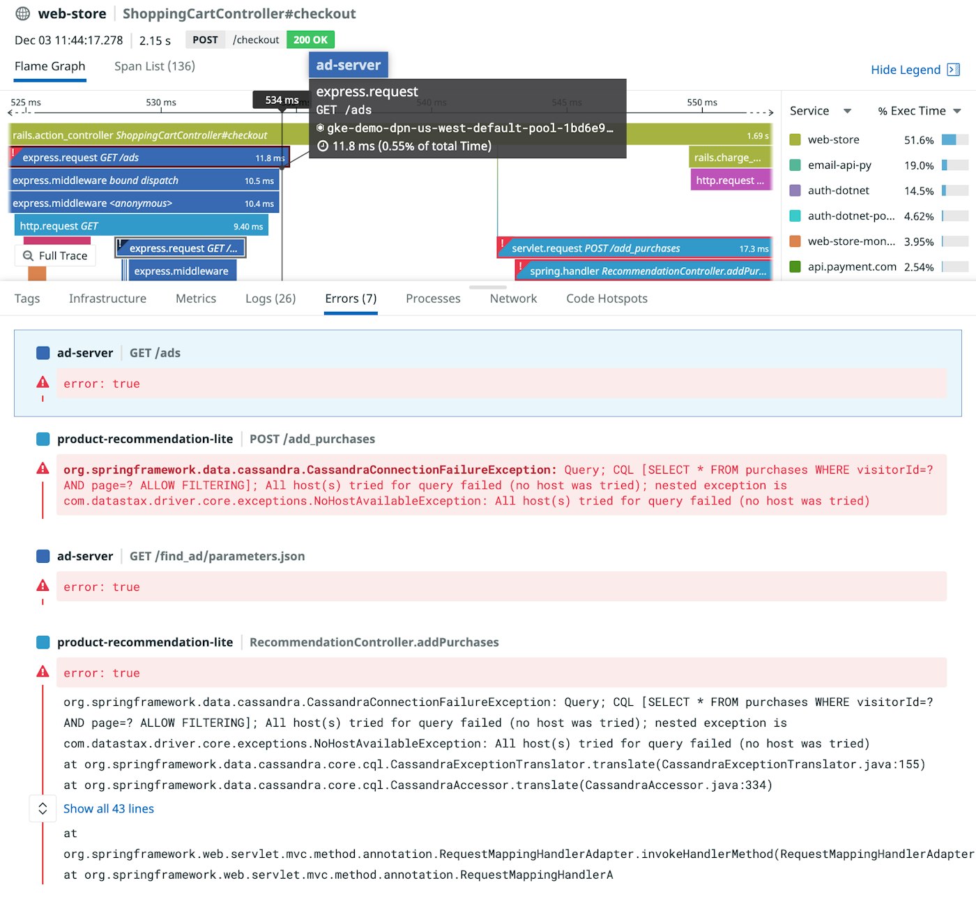
You can click any error in the list to expand it and view the full error text or stack trace. For a closer look at any of the services that have produced errors in this trace, you can explore your services within APM.
Look at the processes running on the host or container
Because slow requests can be caused by processes within the application or external to it, you may need a broader view of the workloads running on the underlying hosts or containers to find the root cause. If your infrastructure's CPU or memory resources are constrained, examining its running processes can help you understand which service or third-party software is contributing to the problem. The Processes tab lists all of the processes running on the host or in the pod that executed the transaction represented by a span in the flame graph. You can see the command that started each process, as well as CPU and memory metrics that show the resources used by the host or pod at the time of the request. You can sort by CPU or memory usage to see which processes are consuming the most resources to determine whether you need to, for instance, refactor any competing workloads or relocate them to another host or pod.
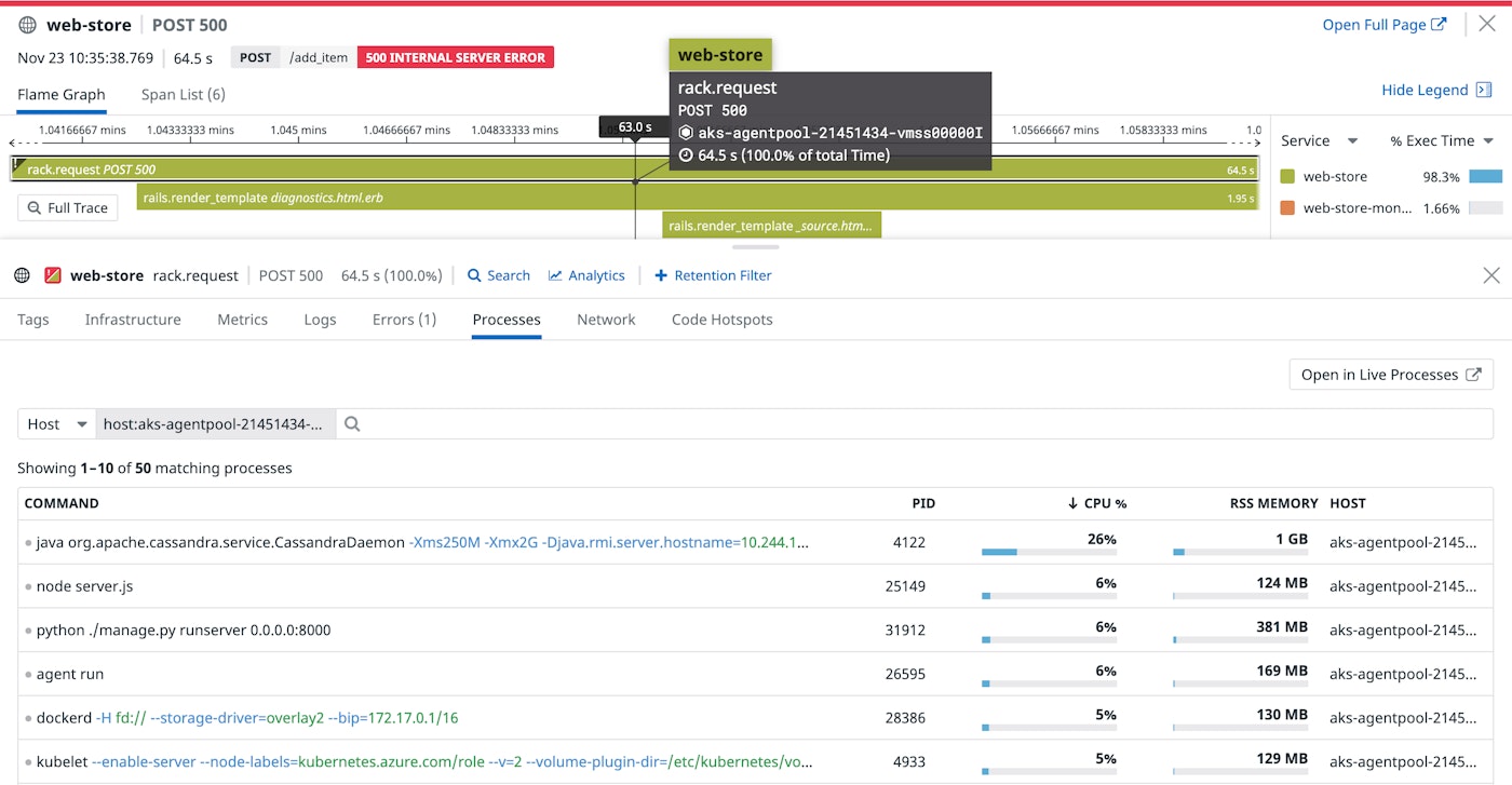
You can click on a process to inspect other metrics, metadata, and relevant logs in more detail in the Live Processes view. See the documentation for more information.
Correlate traces with network data
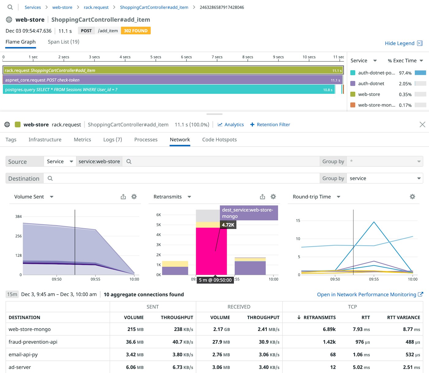
A flame graph can make it easy to spot the source of latency, but often you need further information to determine its cause. The trace view's Network tab visualizes Network Performance Monitoring (NPM) data to help you understand the health of the communication between a service and its dependencies. While APM provides visibility into the health of application requests, the Network tab monitors the underlying network over which these requests are made—the TCP and UDP connections that services use to communicate with endpoints—to show you whether application errors or latency are the result of network problems. This allows you to focus your troubleshooting on the underlying network instead of digging into the application code.
For example, you can quickly spot rising rates of network transmission errors that could explain increased latency in your application. In the screenshot below, the spike in TCP retransmits indicates poor connectivity between the web-store service and the web-store-mongo service, which is likely contributing to the high latency of the trace—11.1 seconds.
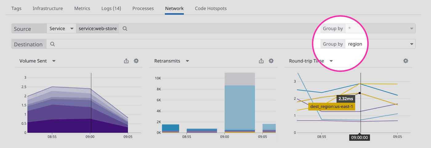
The Network tab also enables you to spot costly or inefficient cross-region traffic that your application is sending. As shown in the screenshot below, you can aggregate connections by region to ensure that—as much as possible—your service is sending traffic only within its local region. This can help you to identify unexpected spikes in cross-region communication that could increase your cloud costs.
See the documentation for more information about using the trace view's Network tab.
Examine code hotspots to understand latency
The Code Hotspots tab displays data from Continuous Profiler to show you how the performance of each method contributes to the overall execution time of the span shown in the flame graph. Clicking on a span shows a breakdown of its execution—time spent on activities like garbage collection, file I/O, and CPU processing—and the methods that were executed for each activity. This can help you identify methods that may need refactoring to improve performance and reduce latency.
In the screenshot below, the Span Profiling Breakdown section lists the profile types available and the
Inverted Stack Trace section lists the methods that were executed. CPU time accounted for 58.8 percent of the request execution time, and the ModelTraining.computeCoefficientsOnFeature method accounted for roughly 84 percent of that.
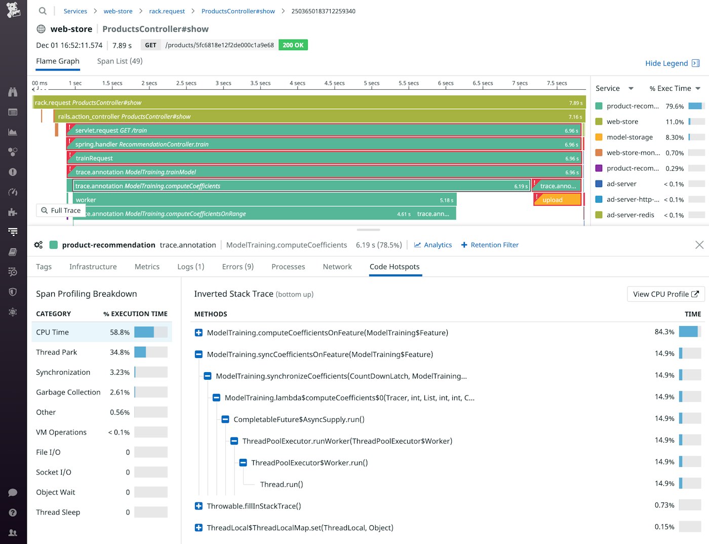
You can easily navigate to Continuous Profiler to understand how this service's code is using resources. In the screenshot above, for example, you can click the View CPU Profile button to pivot to Continuous Profiler to see details about the CPU usage of the methods in this call, which can reveal resource bottlenecks.
Implement end-to-end application monitoring
The trace view graphs your requests and displays correlated metrics and logs, plus related data from RUM, NPM, and Continuous Profiler to maximize your visibility and enable frictionless application monitoring. Check out our trace view documentation for more information. If you're not already using Datadog, sign up for a 14-day free trial.


