Racheal Ou

Tom Sobolik
When you’re looking at thousands of metrics across a high-scale distributed environment with countless potential points of failure, it can be difficult to filter through the noise to spot and diagnose problems. AI-assisted metrics monitoring tools such as anomaly detection, predictive correlations, and root cause analysis (RCA) automation can help you keep pace with the rapidly evolving and expanding architectures your organization relies on. These tools proactively detect and surface potential problems and perform automated analysis to present you with a clearer and more actionable view from your first glance. This makes it faster and easier to glean insights from your metrics so you can perform deeper analyses of your systems’ health and performance, speed up incident investigations, and improve mean time to remediation (MTTR).
In this post, we’ll explore anomaly detection, predictive correlations, and automated RCA and show how you can use each of these with Datadog to:
- Proactively detect anomalous behavior
- Quickly identify potential root causes
- Easily understand the full scope of issues
Proactively detect anomalous behavior
It can be challenging to effectively monitor seasonal metrics that follow recurring patterns. Anomaly detection monitors provide an elegant way to account for seasonality by firing alerts according to a set amount of deviation from the observed pattern, rather than alerting on a fixed threshold. For example, say your webstore service has an errors.by.service metric that regularly spikes on Monday mornings as users return after the weekend. An anomaly monitor can account for this seasonality and only alert when traffic deviates unexpectedly. When the monitor fires an alert, responders know the metric has deviated from its usual pattern for that time of day.
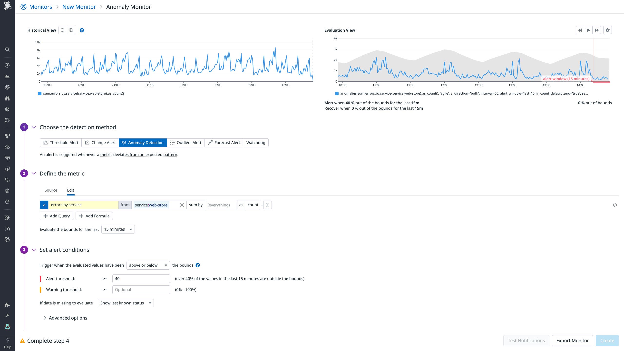
Datadog’s anomaly detection lets you create anomaly monitors simply by defining the metric and alert threshold (how much deviation from the trend will cause the monitor to trigger an alert). You can select from a few different algorithms for cases where you’re looking for anomalies either above or below the trend boundary. The following screenshot shows an anomaly monitor for our errors.by.service example metric.

This monitor is configured to alert when at least 40 percent of data points in a given 15-minute window are considered anomalous. The monitor can help catch unexpected spikes or drops in request volume for reasons such as unexpected traffic surges from a misconfigured client or sudden dips caused by errors in an upstream service. From receiving an alert notification, responders can kick off root cause analysis—looking across the stack to investigate potential issues with service performance or infrastructure health.
Quickly identify potential root causes
When monitoring a service in production, there likely isn’t a single alert that can tell you everything you need to know about the issue at hand. If a piece of your infrastructure is overloaded, for example, you might start by seeing CPU or memory overconsumption, and at the same time the services running on that infrastructure might start throwing errors. This in turn could cause other service dependencies to throw errors; these, if not handled correctly, could cause issues with the infrastructure for those services; and so on.
Querying and correlating metrics for root cause analysis across distributed services and infrastructure can be time-consuming. If you’re working in a broad organization with distributed ownership of services and infrastructure, you might not have immediate access to all the context you would need to make these correlations.
By using AI models to automatically surface correlations in the behavior of related metrics, predictive metric correlations can help you get to the root cause faster. Even in application without comprehensive tracing coverage and dependency mappings, predictive correlations can surface anomalous behavior in the dependencies of a service that’s exhibiting signs of an incident in its metrics. Datadog Metric Correlations lets you surface relevant metric correlations across APM, integrations, and dashboards, as well as any user-defined metric namespaces.
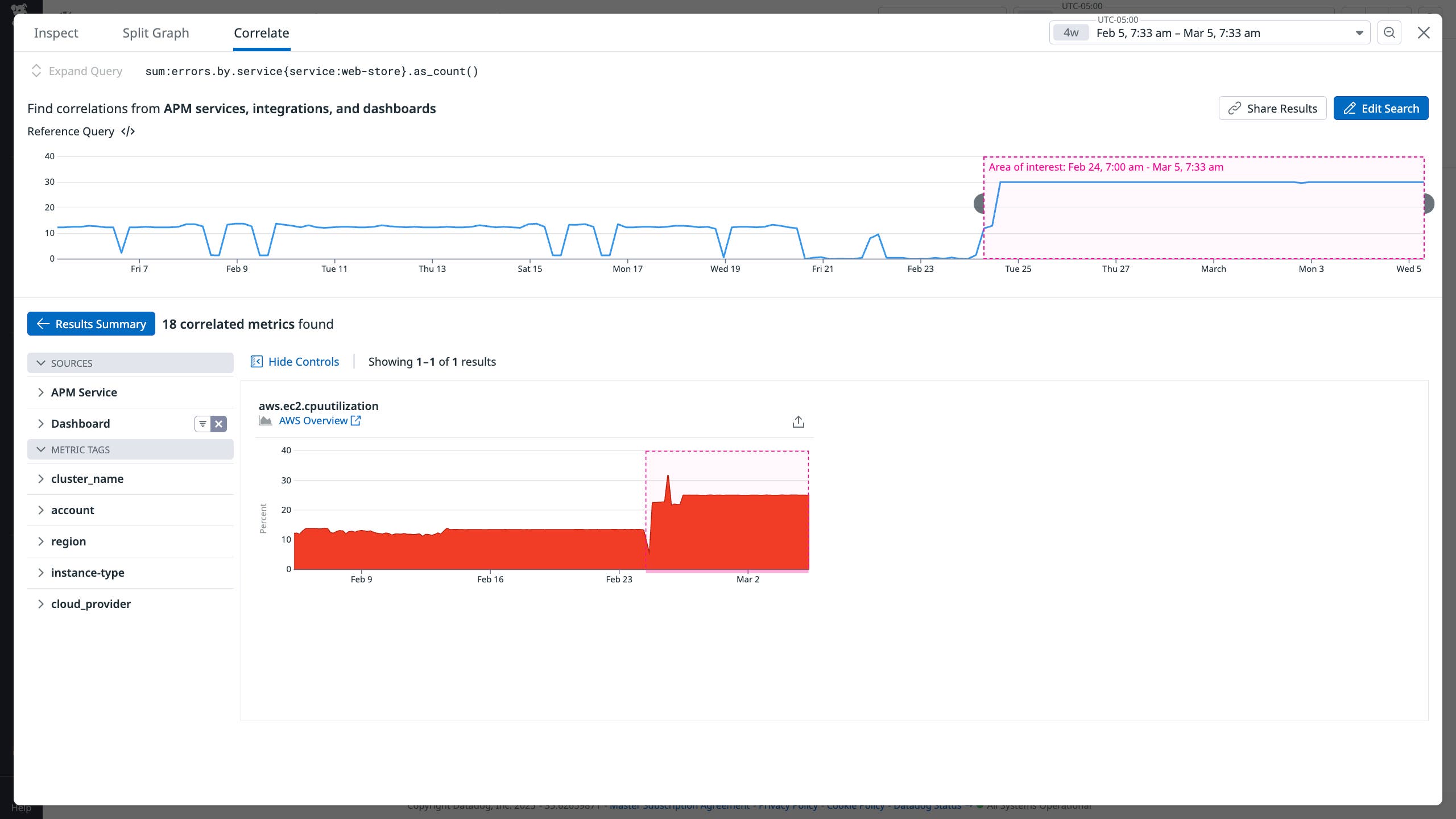
For example, let’s say we want to investigate further into the root cause of the errors.by.service spike we introduced in the previous section. We can start our investigation by launching Metric Correlations from the Metrics Explorer. Metric Correlations will automatically define the area of interest based on anomalous behavior and surface correlations. In the following screenshot, we can see a correlated spike in aws.ec2.cpuutilization for our service.

The correlated metric spikes indicate that a combination of client-side errors and backend retries likely contributed to the surge of incoming requests. With this information in hand, you can investigate further by looking at that service’s infrastructure health metrics or inspecting traces to find sources of errors or latency in upstream dependencies. Without having to piece everything together manually, you’ve more quickly arrived at the next step in your investigation.
Easily understand the full scope of issues
As you investigate significant issues in your distributed systems, particularly in time-critical incident response scenarios, it’s paramount to quickly determine the full scope of the affected services and infrastructure. The faster you are able to loop in all relevant teams in an incident, the more efficiently these stakeholders can coordinate to perform all the necessary remediations and bring the system back to normal.
If part of the scope of an incident is missed, your investigation can be slowed down when new problems enter the picture and compromise remediation plans. But determining the full scope of an issue is challenging in distributed systems, where different teams own different components and anomalies can ripple across services in non-obvious ways. AI-powered RCA tools like Watchdog Explains can help you quickly uncover potential root causes that might otherwise be easy to miss amongst your interrelated services, teams, and infrastructure.
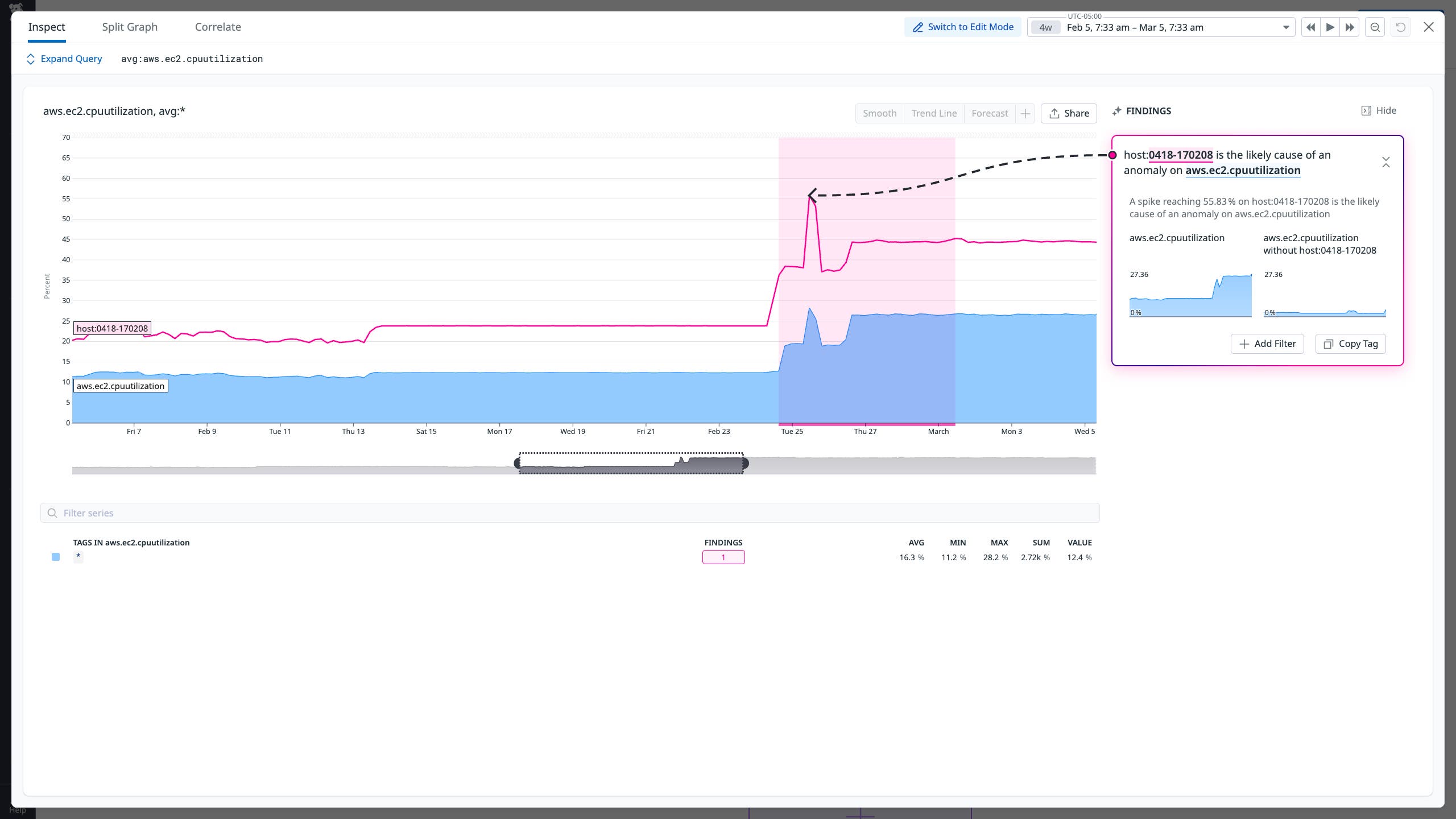
Rather than manually inspecting correlations across all the relevant service, team, infrastructure, and other tags you find in triggered monitors and dashboards, you can use Watchdog Explains to automatically analyze these tags and find correlations that are relevant for you. Watchdog Explains compares timeseries data across each applicable tag group against the source graph to show which tags contribute to the anomalous behavior.
Continuing our previous example, now that we’ve identified errors.by.service’s CPU utilization as an issue, we can use Watchdog Explains to figure out how widespread this issue may be. After automatically detecting the anomaly on the graph, Watchdog Explains surfaces that host:0418-170208 is the likely cause. After validating the finding by examining the graph both with and without the host tag filter, you can focus your investigation on the problematic host.

Harness AI-powered metrics monitoring with Datadog
Using AI-powered metrics monitoring capabilities like anomaly detection, predictive correlations, and automated RCA can help automatically uncover hidden relationships and trends in your data, speeding up the detection and resolution of issues.
Datadog’s AI-powered metrics monitoring features—including anomaly monitors, Watchdog Explains, and Metric Correlations—enable you to quickly and accurately analyze your metrics to spot and investigate critical issues in your environment. For more information, check out our documentation for Metrics, Watchdog, and Graph Insights. If you’re brand new to Datadog, sign up for a free trial.


